When Nintendo uploaded the Switch 2 reveal teaser, people were quick to note that the gameplay footage included had new character designs for The Big N’s mascots. Mario was looking a bit more rotund than usual and Donkey Kong seemingly reverted to its pre-Rare design philosophy. If you thought that was just a placeholder for the reveal, then you would be wrong as Nintendo has seemingly made the redesigns official.

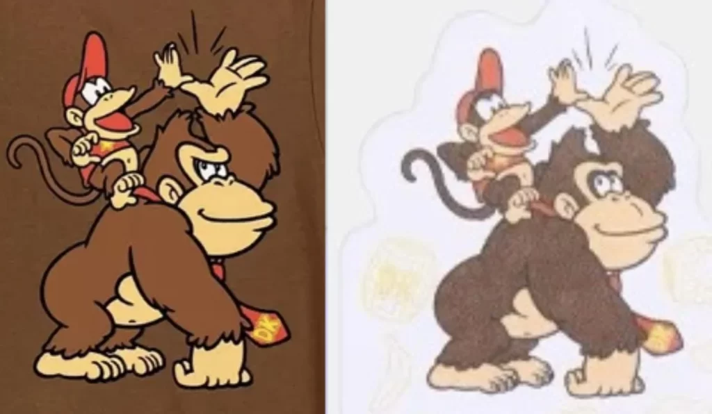
As spotted by users on Reddit, the official Nintendo JP Store has some new DK merchandise that features the “new” DK design. I struggle to really call it new as it does somewhat resemble the current marketing design, just that DK is now happy instead of slightly agitated. He also has a philtrum groove, which is a word I saw on Reddit and learned today, so I’m passing on the knowledge. It mostly looks like more of a refinement of DK’s last redesign, though it also resembles the 94 DK from the Game Boy game.
Considering how long it has been since Donkey Kong Country was released (31 years this year), it would make sense that Nintendo would want to update its character designs for a new generation. You also can’t deny that the success of The Super Mario Bros. Movie likely inspired some of these changes, especially with regards to DK. Ultimately, I’m happy Nintendo is willing to experiment a little with its iconic mascots. Look how many designs we have for Link, for example.
Leave a Comment


