Super Mario Cereal has been the talk of the town ever since leaks of the box art started circulating social media a few days ago. Now that we’ve received confirmation from both Kellogg’s and Nintendo about the December 11th release of the Mario themed munchies (with its amiibo box in tow), fans can only wait in anticipation for it to arrive.
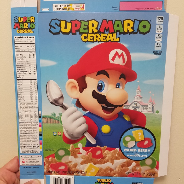
Until then, those hungry for the breakfast food can admire not only the official box art, but also a piece of sample art that Nintendo and Kellogg’s seemed to have considered during the production process. Thanks to redditor Matt1freek, who shared a closeup shot of the sample cereal box, we now know what cover could have been plastered all over grocery store shelves in a few days.
Pretty cool, huh?
When placed side by side, you’ll notice a couple big differences between the two designs right off the bat. For one thing, Mario’s donning Cappy in the final design, whereas his usual “M” hat sits on his head in the sample. The sample art also shows more of the more universally known Mushroom Kingdom background featuring Peach’s castle — that was later replaced with the more specific Super Mario Odyssey map that we’ve come to know very well ever since the game’s release last month. Perhaps the biggest difference lies within the amiibo portion of the final design. It wasn’t even present (on the front, at least) on the sample box.
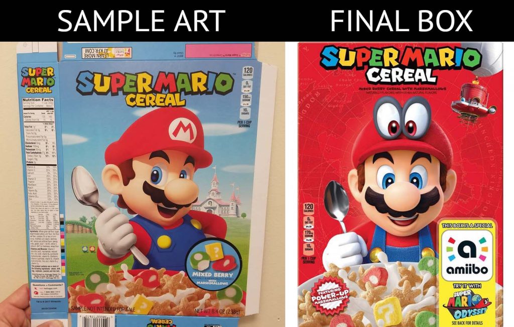
From what we can gather, plans seemed to have changed over the course of Super Mario Cereal’s production. A much heavier focus on Super Mario Odyssey was placed in the product’s marketing. Personally, I’m a fan of the final design — I feel like the imagery would appear bolder and more visually striking as I walked down an aisle in a grocery store over the paler blue box that belongs to the sample.
Whatever your preference is, I think we can agree that no matter what box would have graced store shelves, our attention would have been immediately drawn to that familiar mustached face smiling at us.
Leave a Comment